Design Systems
The Figma guts,
not just the screens.
Polished screens are the easy part to show. This page is about the layer underneath: how components are architected, how properties are named, how a library is organized, and how legacy work gets retired without breaking the teams depending on it.
How I build in Figma

Component architecture + variants
One component family with intentional variants — sized to real product needs, not to every request that arrives.
Properties & naming conventions
Boolean, instance swap, and text properties named so another designer can guess them correctly on the first try.
Auto Layout
Layouts that stretch, wrap, and hug the way the built product does — so handoff matches behavior, not a static frame.

Variables & tokens
Color, spacing, and type values pulled out of components and into shared variables, so a change happens in one place.
Responsive behavior
Breakpoint behavior tested in the file, including content density differences between desktop and small screens.

Mobile ↔ desktop relationships
Deciding when platforms share one component and when a genuine platform difference deserves its own.

Library organization
Pages, sections, and covers structured so people find what they need without asking a designer.

Component documentation
Usage, do/don't, and specs written next to the component — where designers and developers actually look.
Before / After
Not a hypothetical exercise. This is the shape of a real consolidation — hundreds of flows brought together into something a team can actually navigate.
Before
- 47 slightly different versions of something
- Detached components
- Random naming
- Static images
- Duplicated patterns
- Miro + Figma
- Nobody knows which one is current
After
- One component family
- Clear properties
- Reusable assets
- Predictable naming
- Documented patterns
- Organized source of truth
- Shared variables instead of hard-coded values
- Fewer variants doing more work
- Responsive behavior built into the component
- Legacy components labeled and retired on a path
- Prototypes assembled in hours, not days
- New designers onboard without a walkthrough
How I think about components
01
Do we actually need another variant?
A regulatory disclosure requirement would have added a whole new variant. Instead I raised it with Product and Legal to find out what was truly required — and we removed content instead of adding structure.
Read the full story →02
Should mobile and desktop share a component?
I start with responsive behavior and content density. If the same content can breathe at both widths, it stays one component. If the platform genuinely behaves differently, that's a real split — not a convenience one.
03
When should something become a component?
A recurring pattern earns a component. A one-off solution stays a one-off until it proves it isn't. Premature componentization creates maintenance work for something nobody reuses.
04
What happens to legacy components?
Audit → map → consolidate → migrate → deprecate. Nothing gets deleted out from under a team; it gets replaced, labeled, and retired on a path people can follow.
I like a clean Figma file.
Probably more than is reasonable.
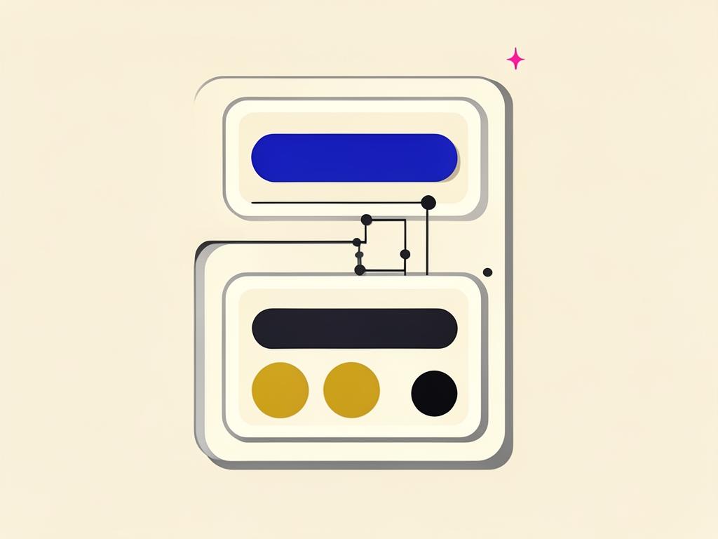
My design-system process
- Audit→
- Identify patterns→
- Consolidate→
- Componentize→
- Document→
- Test→
- Publish→
- Maintain
A design system isn't a one-time library-building exercise. It needs governance and maintenance as the product keeps evolving — otherwise it drifts right back into the "before" column.
Recognition
- Connection Award — ANDi / Fusion designs and high-fidelity prototypes
- WMA WebAward — outstanding achievement in Web Development (AT&T Web Hosting)
"Sonja helped our team's Figma transition by setting up libraries and components for everyone to collaborate with no effort."
"Meticulous — explores alternatives, documents final specs, and notices things the rest of us miss."
"Took the time to teach teammates Figma instead of just handing over files."